
はじめに
Flutterを最近はじめました。
公式のチュートリアルを一通りやってWidgetの使い方に慣れてきました。
これからはどんどんと各Widgetを深掘りしていこうと思います。
今回はExpandedとLayout(Column, Row)を使ってLINEの会話画面の下のチャット入力欄のようなものを作っていきたいと思います。
環境
- Flutter 3.0.1
- Dart 2.17.1
Widgetの紹介
Column, Row
このウィジェットは横(Row)や縦(Column)へフレキシブルにWidgetを配置することができます。
以下の例だと3つのContainerをColumnの子に宣言してあげることで、垂直に等間隔にContainerを配置することができています。
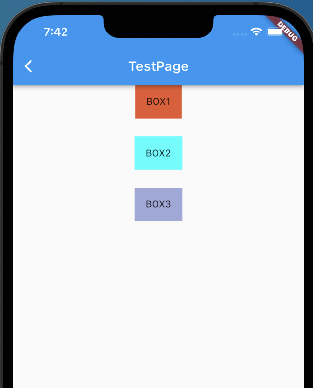
mainAxisAlignmentによって等間隔で縦並びにするようにしています。
それ以外の値により、上詰めや下詰めも可能です。

class TestWidget extends StatelessWidget {
  const TestWidget({Key? key}) : super(key: key);

  @override
  Widget build(BuildContext context) {
    return Scaffold(
      appBar: AppBar(
        title: Text(
          'TestPage',
        ),
      ),
      body: SafeArea(
        child: Container(
          height: 200,
          child: Center(
            child: Column(
              mainAxisAlignment: MainAxisAlignment.spaceBetween,
              children: [
                Container(
                  decoration: BoxDecoration(
                    color: Color.fromARGB(255, 231, 88, 45),
                  ),
                  child: Padding(
                    padding: const EdgeInsets.all(16.0),
                    child: Text('BOX1'),
                  ),
                ),
                Container(
                  decoration: BoxDecoration(
                    color: Colors.cyanAccent[200],
                  ),
                  child: Padding(
                    padding: const EdgeInsets.all(16.0),
                    child: Text('BOX2'),
                  ),
                ),
                Container(
                  decoration: BoxDecoration(
                    color: Colors.indigo[200],
                  ),
                  child: Padding(
                    padding: const EdgeInsets.all(16.0),
                    child: Text('BOX3'),
                  ),
                ),
              ],
            ),
          ),
        ),
      ),
    );
  }
}

Expanded
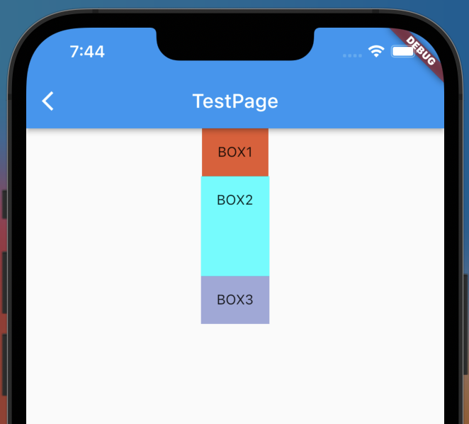
このウィジェットはExpandedで指定したウィジェットが他のスペースを拡張するように保管するものです。
例としてはExpandedで指定したBOX2のコンテナが他のスペースを補完するようになっていることが分かります。
class TestWidget extends StatelessWidget {
const TestWidget({Key? key}) : super(key: key);
@override
Widget build(BuildContext context) {
return Scaffold(
appBar: AppBar(
title: Text(
'TestPage',
),
),
body: SafeArea(
child: Container(
height: 200,
child: Center(
child: Column(
mainAxisAlignment: MainAxisAlignment.spaceBetween,
children: [
Container(
decoration: BoxDecoration(
color: Color.fromARGB(255, 231, 88, 45),
),
child: Padding(
padding: const EdgeInsets.all(16.0),
child: Text('BOX1'),
),
),
Expanded(
child: Container(
decoration: BoxDecoration(
color: Colors.cyanAccent[200],
),
child: Padding(
padding: const EdgeInsets.all(16.0),
child: Text('BOX2'),
),
),
),
Container(
decoration: BoxDecoration(
color: Colors.indigo[200],
),
child: Padding(
padding: const EdgeInsets.all(16.0),
child: Text('BOX3'),
),
),
],
),
),
),
),
);
}
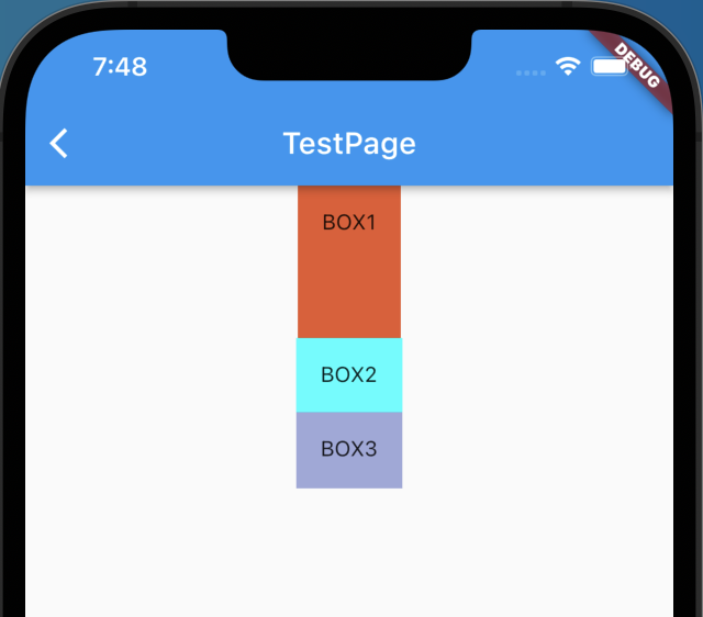
}また、Expandedにてflexを指定してあげることで拡張の大きさを指定することができます。
今回はBOX1,BOX3にExpandedを指定しており、BOX1にflex 2を指定しています。
              children: [
                Expanded(
                  flex: 2,
                  child: Container(
                    decoration: BoxDecoration(
                      color: Color.fromARGB(255, 231, 88, 45),
                    ),
                    child: Padding(
                      padding: const EdgeInsets.all(16.0),
                      child: Text('BOX1'),
                    ),
                  ),
                ),
                Container(
                  decoration: BoxDecoration(
                    color: Colors.cyanAccent[200],
                  ),
                  child: Padding(
                    padding: const EdgeInsets.all(16.0),
                    child: Text('BOX2'),
                  ),
                ),
                Expanded(
                  child: Container(
                    decoration: BoxDecoration(
                      color: Colors.indigo[200],
                    ),
                    child: Padding(
                      padding: const EdgeInsets.all(16.0),
                      child: Text('BOX3'),
                    ),
                  ),
                ),
              ],

LINE風のテキスト入力欄の作成
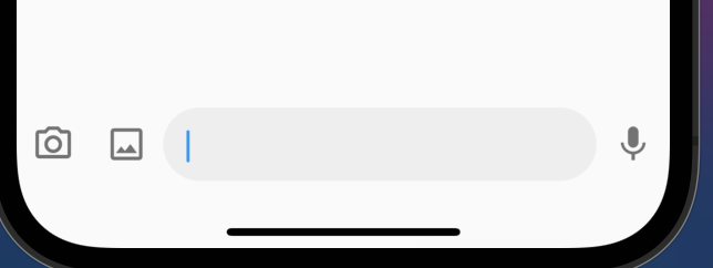
今まで説明してきたExpandedとLayout(Row)を使ってLINE風のテキスト入力欄を作成していきます。
要領としては写真アイコンやマイクアイコンテキストボックスは横並びなのでRowの中にそれらを記述していくイメージで、そのうちテキストボックスは他のスペースを埋めるくらい広くしたいのでExpandedを使用しています。
なお、微調整としてPaddingを使っています。
  Container TextInputWidget(BuildContext context) {
    return Container(
      height: 68,
      child: Row(
        children: [
          IconButton(
            onPressed: () {},
            icon: Icon(Icons.camera_alt_outlined),
            iconSize: 28,
            color: Colors.black54,
          ),
          IconButton(
            onPressed: () {},
            icon: Icon(Icons.photo_outlined),
            iconSize: 28,
            color: Colors.black54,
          ),
          Expanded(
            child: Container(
              padding: EdgeInsets.symmetric(
                horizontal: 16.0,
              ),
              decoration: BoxDecoration(
                color: Colors.grey.shade200,
                borderRadius: BorderRadius.circular(40),
              ),
              child: TextField(
                autofocus: true,
                decoration: InputDecoration(
                  border: InputBorder.none,
                ),
              ),
            ),
          ),
          IconButton(
            onPressed: () {
              Navigator.of(context)
                  .push(MaterialPageRoute(builder: (BuildContext context) {
                return TestWidget();
              }));
            },
            icon: Icon(Icons.mic),
            iconSize: 28,
            color: Colors.black54,
          ),
        ],
      ),
    );
これをお手軽に作成できるFlutterがすごい…
おわり
コメント